<box>
| Attributes | Common Children |
| align | <box> |
| valign | <menu> |
| class | <button> |
| id | <text> |
| flex | <image> |
| width | |
| height | |
| autostretch | |
| orient | |
| oncommand |
<titledbox>
| Attributes | Common Children |
| same as above | same as above + |
| <title> | |
The <box> widget provides a general purpose and flexible layout mechanism. Using boxes, you can specify the position and relationship of almost any combination of widgets in the UI. Many XUL widgets inherit from boxes, including:
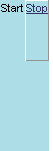
Boxes use flex to stretch their positions in a UI. Springs with flex push back against boxes, constraining them within the parent container. The following example shows a simple box and spring layout using all of box's basic attributes:
Titled Boxes
The titledbox is derived from the basic box, but supports a special child element for attaching a label-like title to the box container, as in the following example:
<button value="Click Me" /> <button value="Push Me" /> </titledbox> </window>
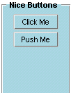
In all other respects, the <titledbox> element is the same as the box.
align is an optional attribute that specifies the alignment of the current element's children.Syntax
<element align="left | right | center | vertical | horizontal">Example
Notes
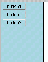
<box width="150" orient="vertical" autostretch="never" style="border: solid 2px; background-color: lightblue" align="right">
<button value="button1" style="font-size: 12pt"/>
<button value="button2" style="font-size: 12pt"/>
<button value="button3" style="font-size: 12pt"/>
</box>
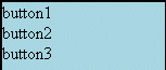
The default value for align is left. In addition to the left, center, and right values, align also supports "horizontal" and "vertical", though these latter two are both deprecated. Remember that the attribute referes to the alignment of the children and not the parent element.
valign is an optional attribute that specifies the vertical alignment of the current element's children.Syntax
<element valign="top | middle | baseline | bottom ">Example
Notes
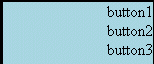
<box width="150" orient="vertical" autostretch="never"
  style="border: solid 2px; background-color: lightblue"
  valign="baseline">
    <button value="button1" style="font-size: 12pt"/>
    <button value="button2" style="font-size: 12pt"/>
    <button value="button3" style="font-size: 12pt"/>
</box>
<box width="150" orient="vertical" autostretch="never" style="border: solid 2px; background-color: lightblue" valign="middle" <button value="button1" style="font-size: 12pt"/> <button value="button2" style="font-size: 12pt"/> <button value="button3" style="font-size: 12pt"/> </box>
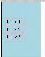
The default value for valign is middle. Remember that the attribute referes to the vertical alignment of the children and not the parent element.
flex is used to position widgets and establish their flexibility relative to one another.
Syntax
<element flex="integer">Examples
Notes
Flex is one of the principal ways to size and arrange widgets in the UI. Using boxes, springs, flex, and the functional XUL widgets you need, you can layout the interface in any way you choose.In the example above, the inner box widget is vying for space with the spring widget. Both of them have been given flex, but the greater flex of the spring widget has resulted in a spring element (below the two buttons) that is three times as tall as the buttons themselves.
When flexible widgets (widgets for which some flex value has been specified) are arranged with other, unflexible widgets, the flex of the flexible widgets is always understood to be complete. The inflexible widgets in this case take up only as much space as they need to fulfill their other requirements: that their values be displayed, that the style considerations like padding and borders are met, and so on.
When the flex attribute is not specified, an element is understood to have a flex of zero.
width is an optional attribute that specifies the width of the box in pixels or percentage of available space.Syntax
<element width="width in pixels">Example
Notes<menubar width="100px" style="background-color:lightblue;">
When you do not specify a width or height, boxes and other elements will rely upon flex to figure out how much space to occupy. With no flex and no size attributes, a box will take only as much space as is needed to display whatever value or name attributes that have been specified.When an element does have some flexibility, the width is understood to be the minium width, past which the element flexes into the containing space.
height is an optional attribute that specifies the width of the box in pixels or percentage of available space.Syntax
<element height="height in pixels">Example
Notes<menubar height="100" style="background-color:lightblue;">
When you do not specify a width of height, boxes and other elements will rely upon flex to figure out how much space to occupy. With no flex and no size attributes, a box will take only as much space as is needed to display whatever value or name attributes that have been specified.When an element does have some flexibility, the height is understood to be the minium height, past which the element flexes into the containing space.
autostretch is an optional attribute that turns a box's autostrething on and off.Syntax
<element autostretch="never | always">Example
Notes<box autostretch="never" style="background-color:lightblue;">
The autostretch attribute gives you control over a box's tendency to stretch its child elements to fit in the opposite direction of the box. When a box is aligned vertically, for example, it will stretch its children out horizontally automatically unless you specify otherwise. The figure below demonstrates how autostretch prevents the stretching of the box's button children.
| <box style="background-color: lightblue; border: solid 2px"
orient="vertical">
<button value="button1" style="font-size: 10pt"/> <button value="button2" style="font-size: 14pt"/> <button value="button3" style="font-size: 24pt"/> <button value=" default stretching " style="font-size: 10pt"/> </box> <box style="background-color: lightblue; border: solid 2px" autostretch="never"
orient="vertical">
|
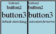 |
orient is an optional attribute that specifies the alignment of the children of the current element.Syntax
<element orient="vertical | horizontal">Example
Notes
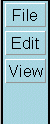
<menubar orient="vertical"
style="background-color:lightblue;">
The orient attribute takes the place of align as the way to orient an element's child elements either end-to-end or top-to-bottom. Though align still accepts "vertical" and "horizontal" as values, these are now deprecated.
oncommand is a generalized event listener attribute that's called when the user takes some action on the element.Syntax
<element oncommand="javascript event handler code">Example
<box oncommand="alert('Parent box got the event')">
  <menulist ...
  ...
</box>
Notes
The oncommand attribute is available to all elements that inherit from box, which is just about everyrthing in the toolkit. Use oncommand whenever you want to write an event handler for an element that doesn't have some more specific event listener attributes.